#Import Libraries
library(tidyverse)
library(data.table)
library(forecast)
library(tidymodels)
library(modeltime)
library(timetk)

#Import Data
raw_sales_data = read_csv("stores_sales_forecasting.csv") %>% as_tibble()Stores Sales
Overview
Store Sales Forecasting Data contains customer transaction records. Our goal is to create a forecast model that will help us identify the future movement of our Sales and Quantity for inventory management. Developing this type of model can help us better assess our quarterly or yearly sales performance and have a more accurate product re-stocking based on order quantity projection.
#Check row id if unique
nrow(raw_sales_data) == raw_sales_data$`Row ID` %>% unique() %>% length()
[1] TRUE#Row Ids are unique.#Check each variable, Uni and Bivariate analysis
#We have a date column, lets convert it into date object so we can use it on time series plots
raw_sales_data = raw_sales_data %>%
mutate(
`Order Date` = as.Date(`Order Date`,"%m/%d/%Y"),
`Ship Date` = as.Date(`Ship Date`,"%m/%d/%Y")
)
#Check frequency of Ship Mode
raw_sales_data %>%
ggplot(aes(x = `Ship Mode`)) +
geom_bar()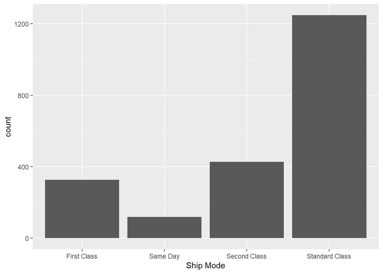
#Standard Class is the most common way of shipping products

#Which segment is the most common? and what are other segment categories??

raw_sales_data %>%
  ggplot(aes(x = Segment)) +
  geom_bar()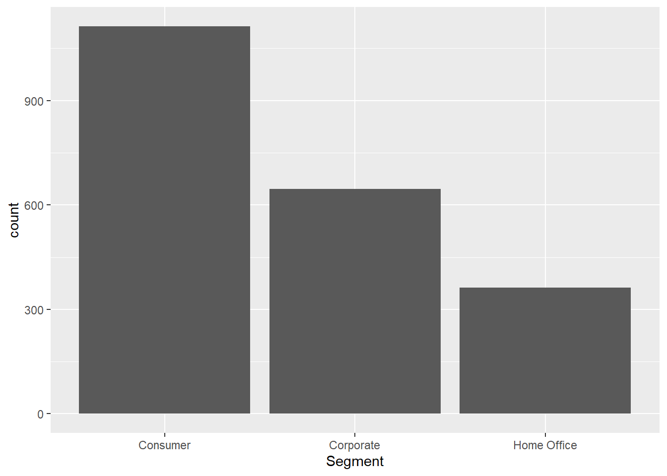
#Majority of our segment came from consumer.

raw_sales_data %>%
  ggplot(aes(x = reorder(State,State,function(x) + length(x) ))) +
  geom_bar() +
  coord_flip() +
  labs(
    x = "State"
  )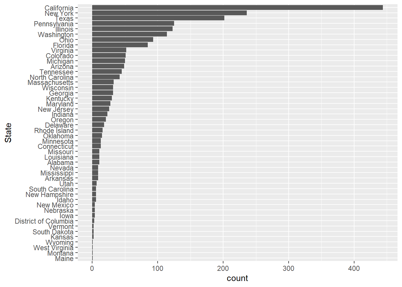
#So our top five for states sales are
#California, New Yori, Texas, Pennsylvania and Illinois

#Table for better view
raw_sales_data %>%
  count(State, sort = TRUE)
# A tibble: 48 × 2
State n
<chr> <int>
1 California 444
2 New York 236
3 Texas 202
4 Pennsylvania 125
5 Illinois 123
6 Washington 114
7 Ohio 93
8 Florida 85
9 Virginia 52
10 Colorado 51
# ℹ 38 more rows#Check Region
raw_sales_data %>%
ggplot(aes(x = reorder(Region,Region, function(x) + length(x)) )) +
geom_bar() +
labs(
x = "Region"
)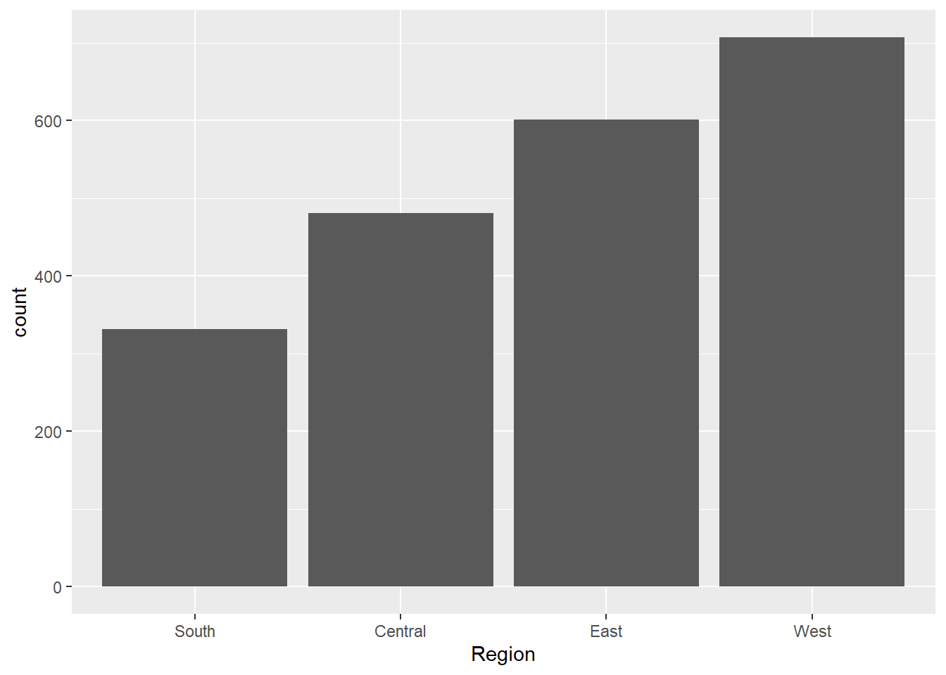
#We have most of our sales coming from West Region

#Lets check Product Sub Category

raw_sales_data %>%
  ggplot(aes(x = reorder(`Sub-Category`,`Sub-Category`,function(x) - length(x)))) +
  geom_bar() +
  labs(
    x = "Sub-Category"
  )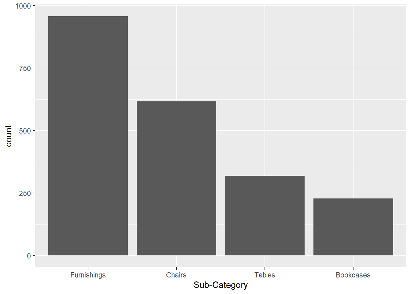
#Majority of our sales came from Furnishing

#Check range of quantity and distribution
range(raw_sales_data$Quantity)
[1] 1 14#Ranges from 1 to 14
#Check shape
raw_sales_data %>%
ggplot(aes(x = Quantity)) +
geom_histogram()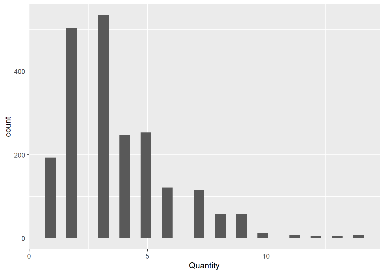
#Positively Skewed. 3 seems to be the most common quantity for orders


#Check discounts?
range(raw_sales_data$Discount)
[1] 0.0 0.7#highest Discount we gave was 70% off
raw_sales_data %>%
ggplot(aes(x = Discount)) +
geom_histogram()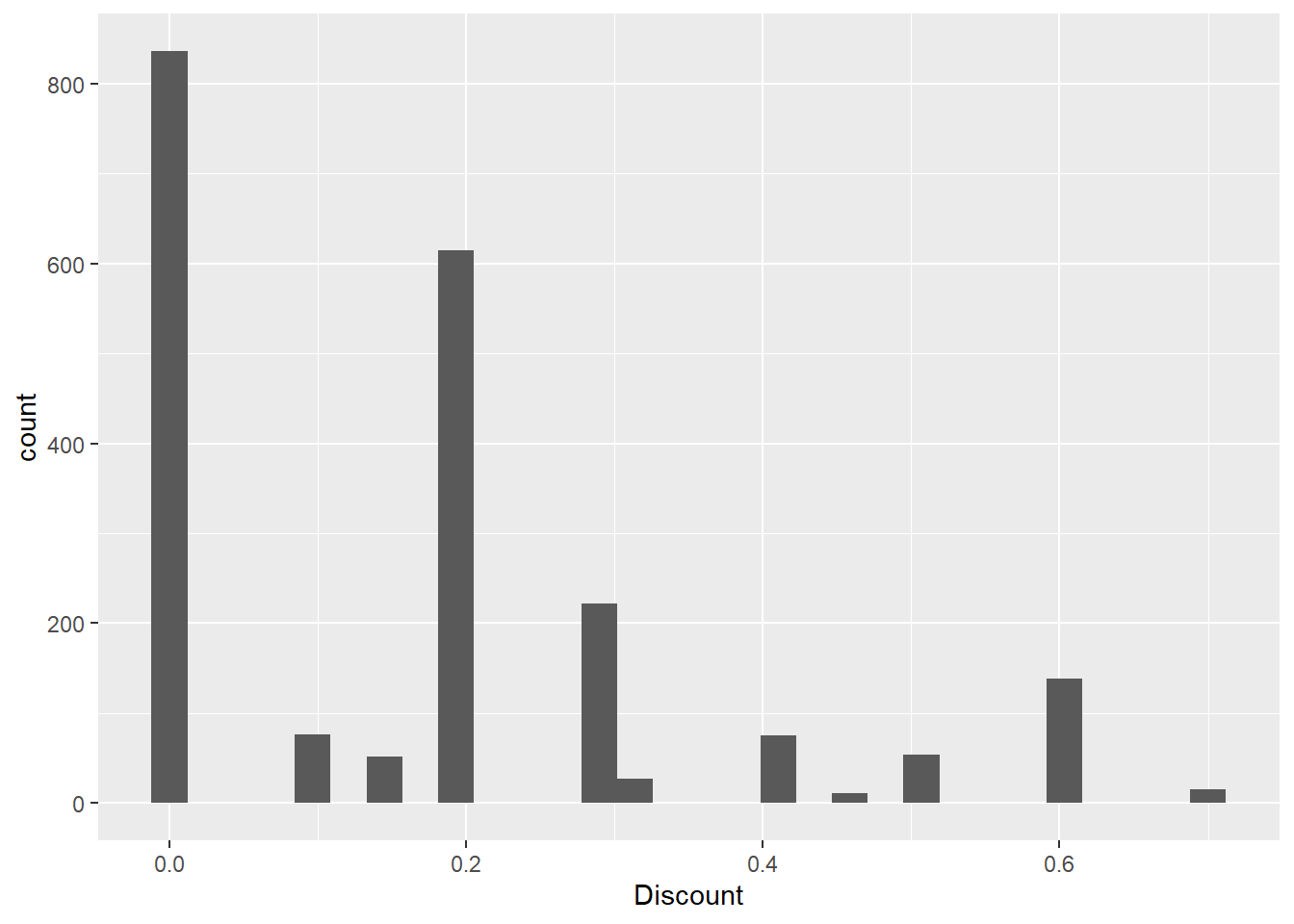
#As expected, highest count was zero for discount, since not all the time we are giving off discount


#Check profit
summary(raw_sales_data$Profit)
Min. 1st Qu. Median Mean 3rd Qu. Max.
-1862.312 -12.849 7.775 8.699 33.727 1013.127 #For profit -- we have negative profit, average is 8 USD while max is at 1013.127 USDIs there a trend or seasonal pattern for Negative and Positive Profit?
#Lets use our time data

timed_profit_data = raw_sales_data %>%
  group_by(`Order Date`) %>%
  reframe(
    Profit = sum(Profit,na.rm = TRUE)
  )

timed_profit_data %>%
  ggplot(aes(x = `Order Date`,y = Profit,group = 1)) +
  geom_line()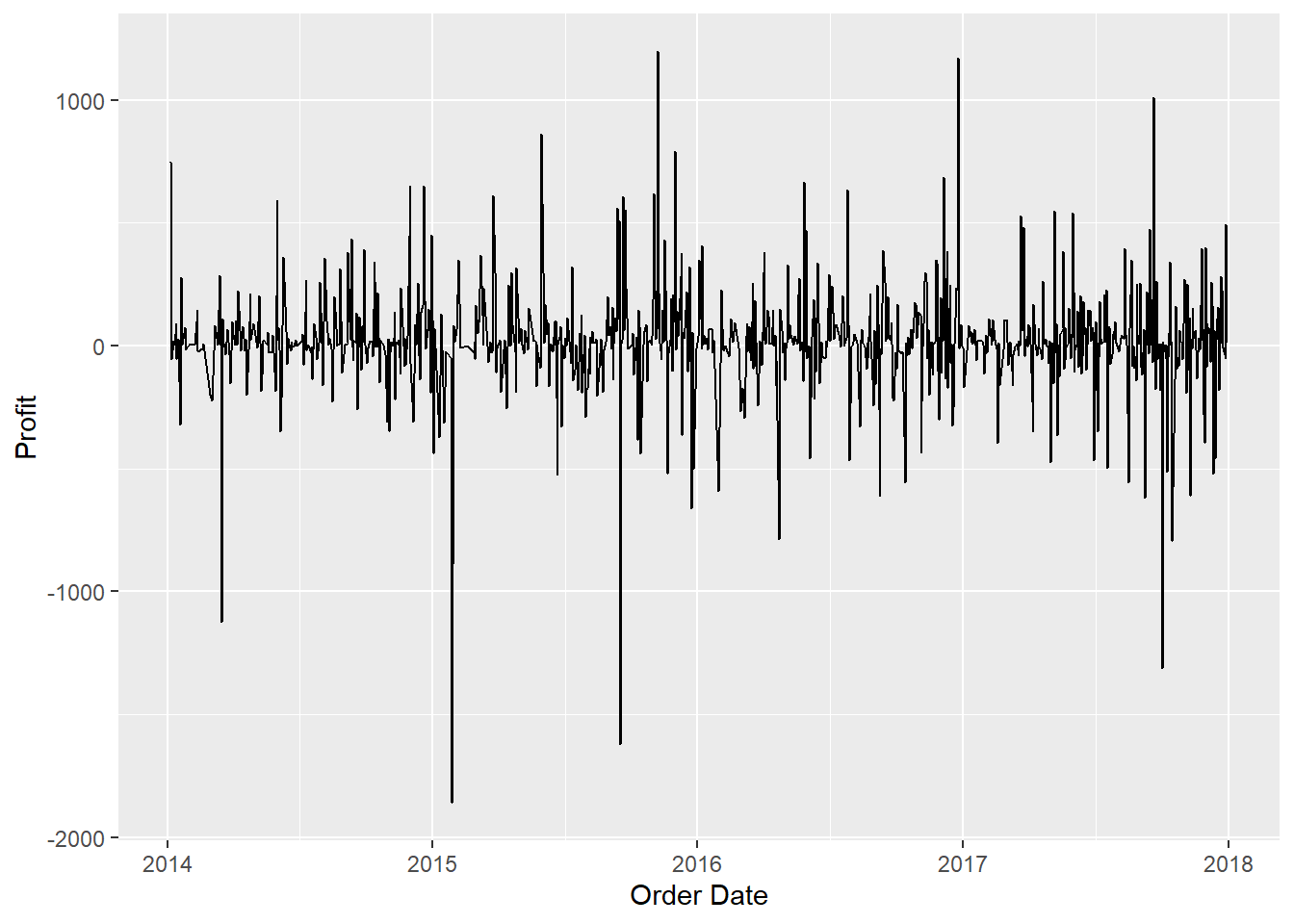
#Ok looks like we already have a stationary data here interms of time series. Its also worth noticing how we have larger profit
#dips compared to profit spike. Let's take a look.

timed_profit_data = timed_profit_data %>%
  mutate(
    Gain_Loss = ifelse(Profit <=0,"Loss","Gain")
  )

timed_profit_data %>%
  count(Gain_Loss)
# A tibble: 2 × 2
Gain_Loss n
<chr> <int>
1 Gain 560
2 Loss 329#37% of our profit turns out to be negative. What is the trend for this value?
timed_profit_data %>%
filter(Gain_Loss == "Loss") %>%
ggplot(aes(x = `Order Date`,y = Profit)) +
geom_point() +
geom_line() 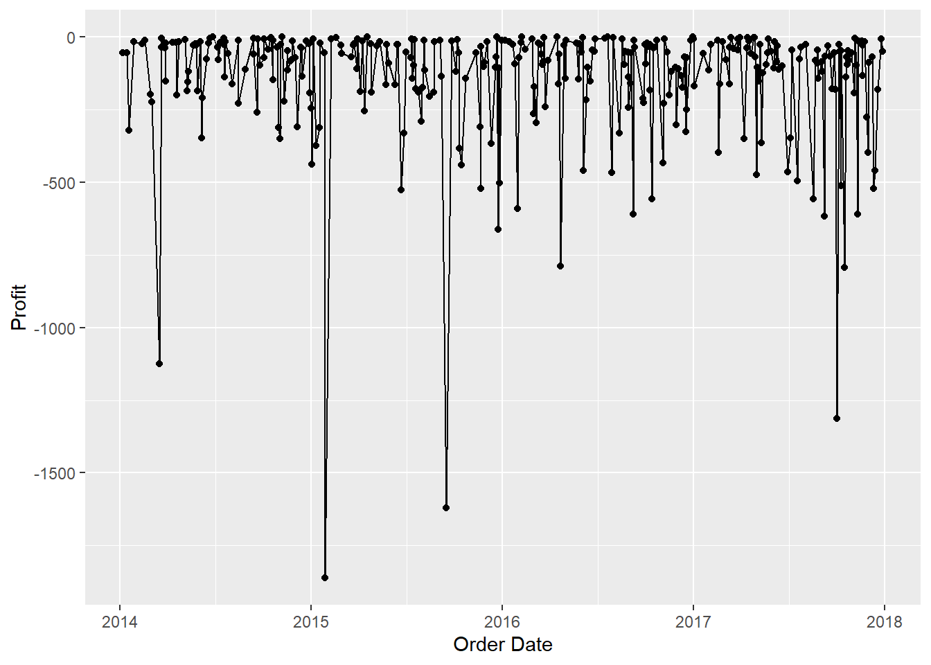
raw_sales_data = raw_sales_data %>%
  mutate(
    Gain_Loss = ifelse(Profit <=0,"Loss","Gain")
  )

gain_loss_count = raw_sales_data %>%
  group_by(`Order Date`,Gain_Loss) %>%
  reframe(
    n = n()
  )

gain_loss_count %>%
  filter(Gain_Loss == "Loss") %>%
  ggplot(aes(x = `Order Date`,y = n)) +
  geom_line()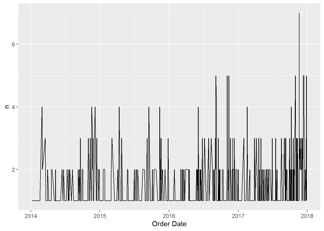
#Lets try to look at it at monthly basis?
raw_sales_data = raw_sales_data %>%
  mutate(
    Month = format(`Order Date`,"%B"),
    Year = format(`Order Date`,"%Y"),
    Month_Year = paste(Month,Year,sep = "-")
  )

month_profit_data = raw_sales_data %>%
  group_by(Month_Year, Gain_Loss) %>%
  reframe(
    n = n()
  ) %>%
  mutate(
    Month_Year = paste(Month_Year,"01",sep = "-"),
    Month_Year = as.Date(Month_Year,"%B-%Y-%d")
  )

month_profit_data %>%
  filter(Gain_Loss == "Loss") %>%
  ggplot(aes(x = Month_Year, y = n, group = 1)) +
  geom_point() +
  geom_line()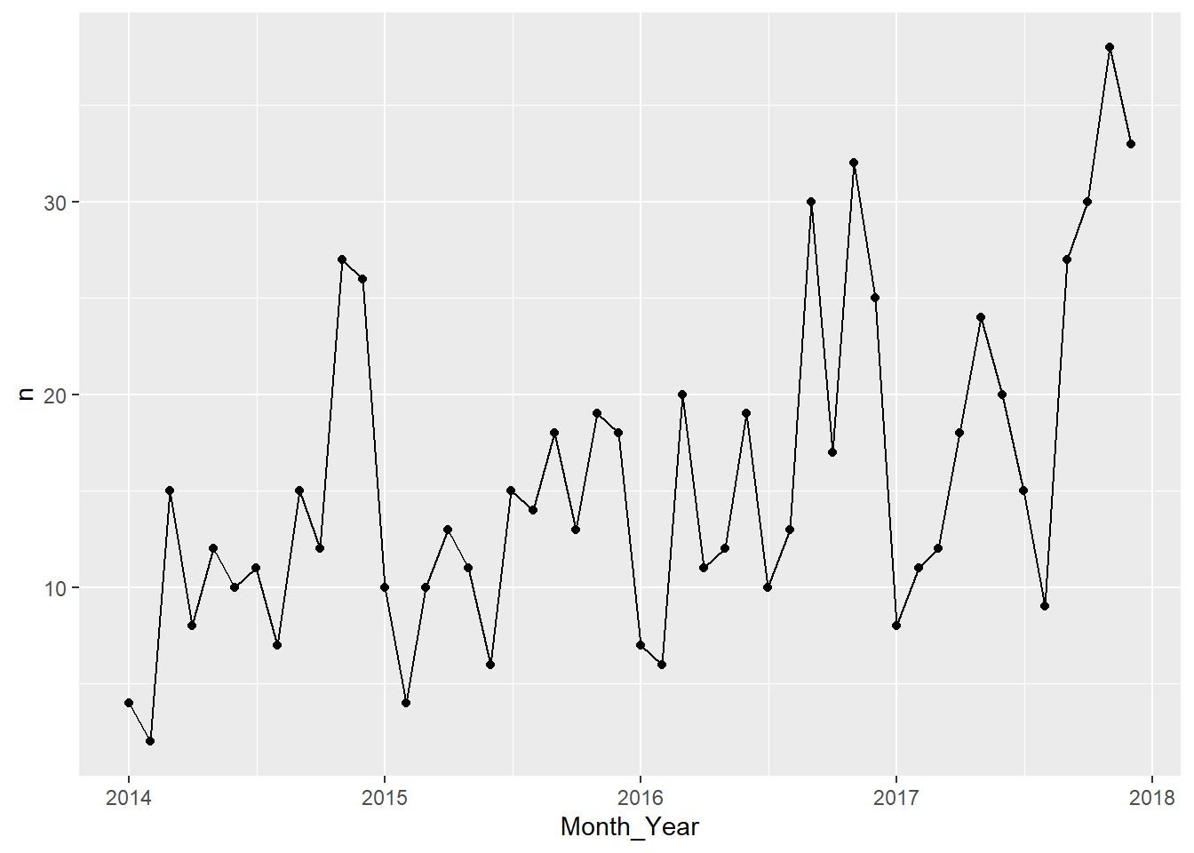
Interesting, Just by looking at it, it seems like the number of negative profits we have per month has a trend and seasonality. Best way to check it is to try to extract the time series components of our data.
monthly_loss = month_profit_data %>%
  filter(Gain_Loss == "Loss") %>%
  select(-Gain_Loss)

ts_loss = ts(monthly_loss$n,start = c(2014,01),frequency = 12)
plot(ts_loss)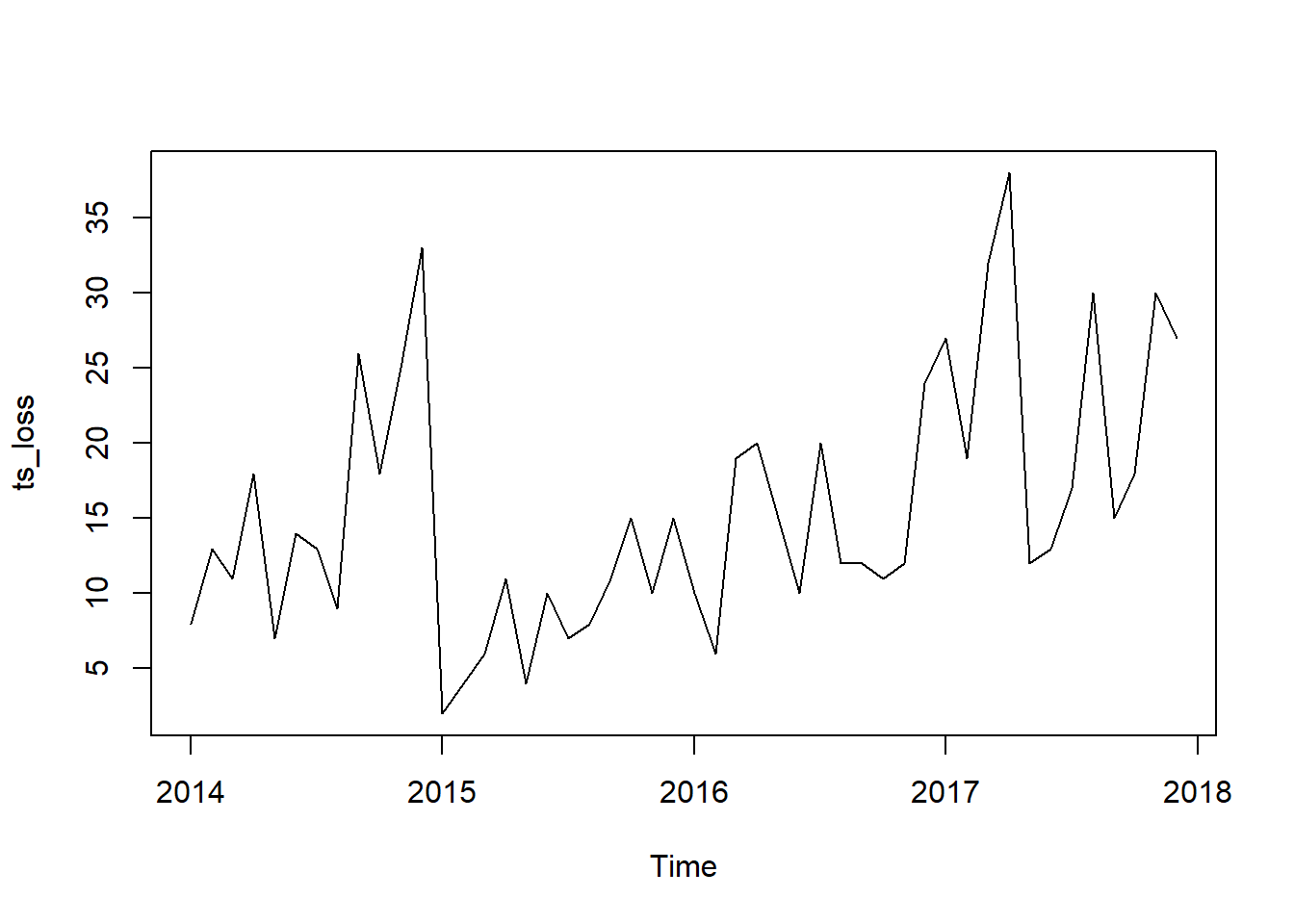
decompose(ts_loss) %>% plot()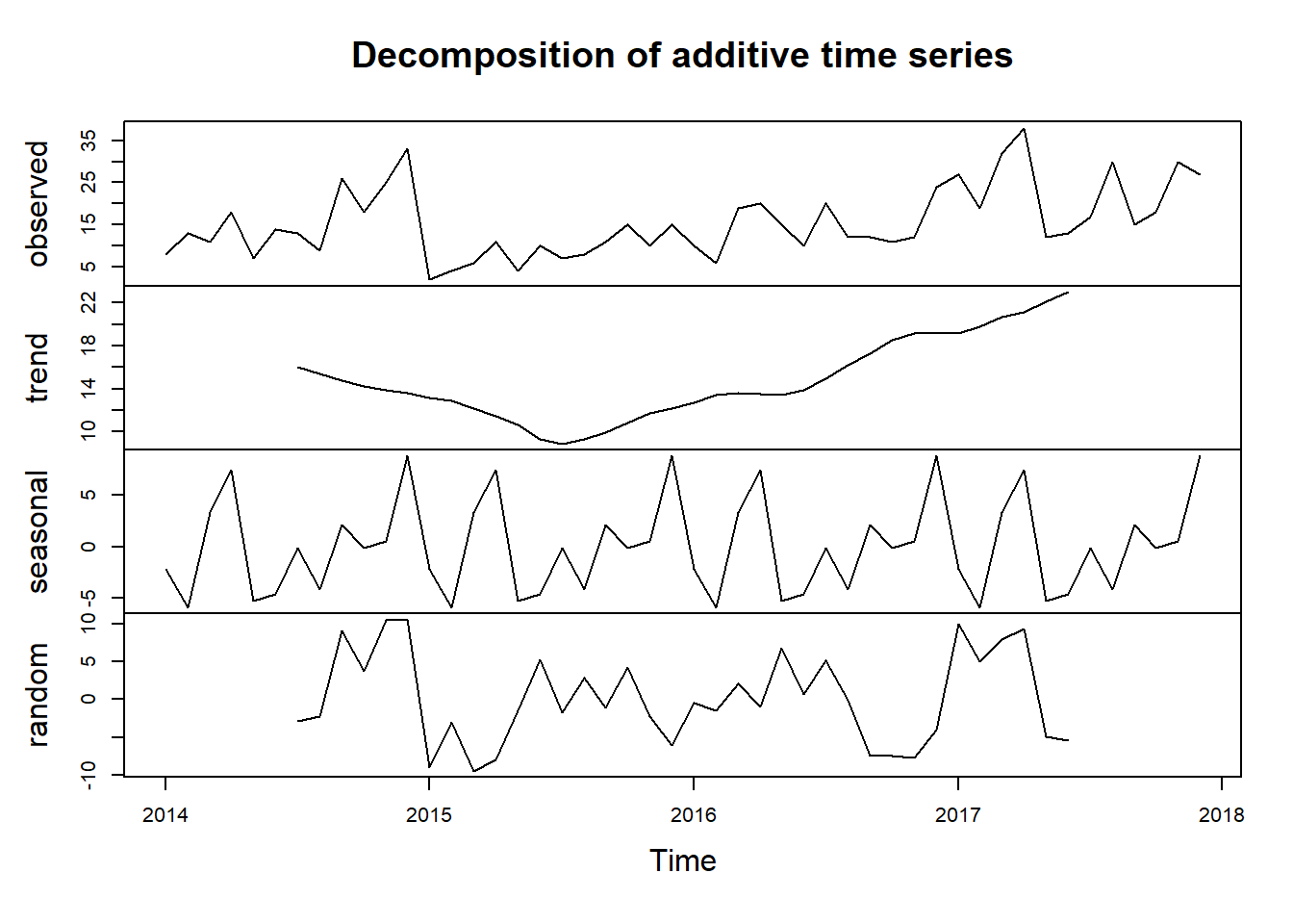
Looks like our hunch is correct, we have a seasonal data on our hand. Looking at the seasonal component, it seems like that we usually experience a high count of Loss in profit at the end of the year. This could be attributed to end of year sale we usually implement.
Lets try to look the gain side of the data. See if we can spot a trend or seasonality as well
monthly_gain = month_profit_data %>%
  filter(Gain_Loss == "Gain") %>%
  select(-Gain_Loss)

ts_gain = ts(monthly_gain$n,start = c(2014,01),frequency = 12)
plot(ts_gain)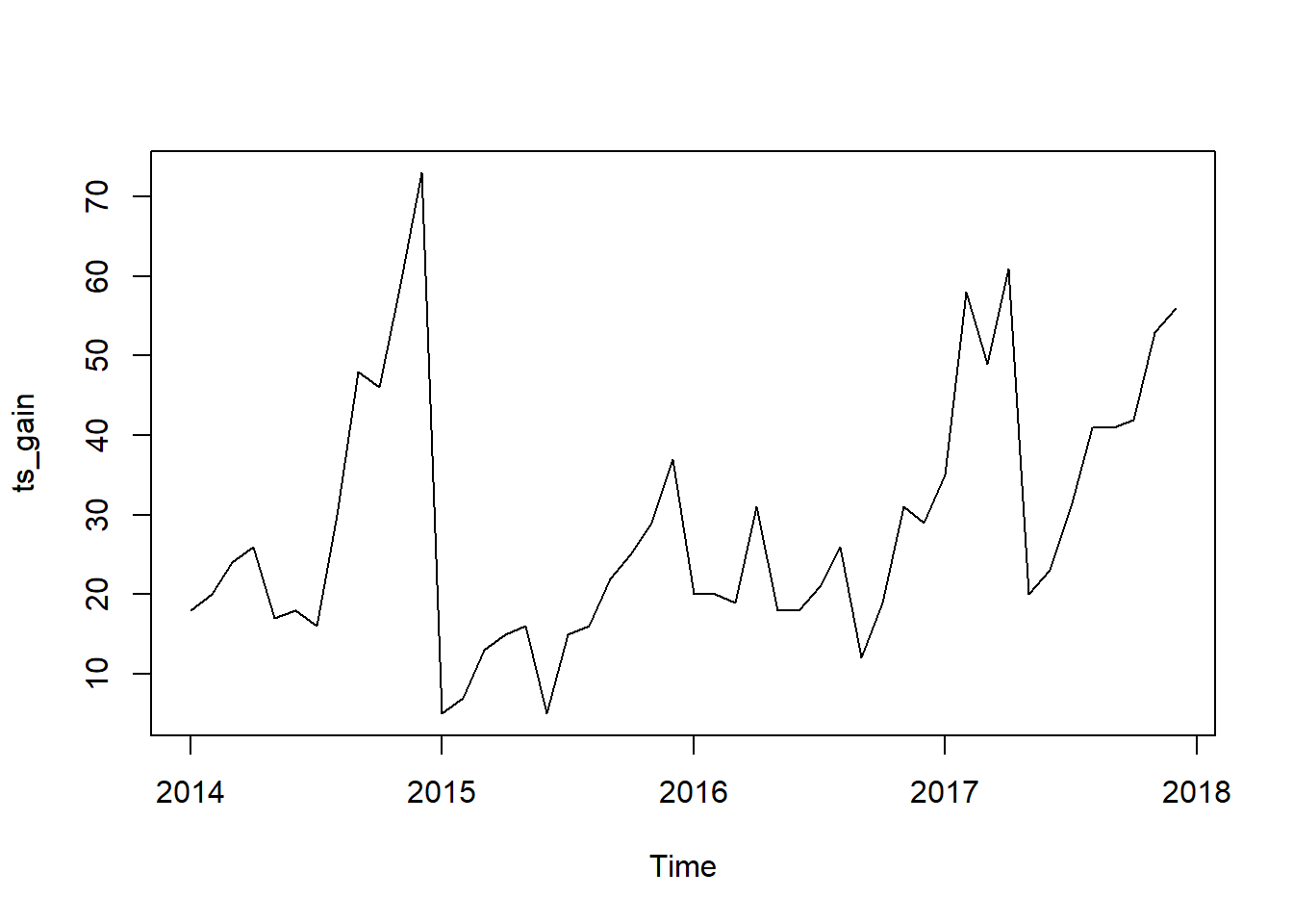
decompose(ts_gain) %>% plot()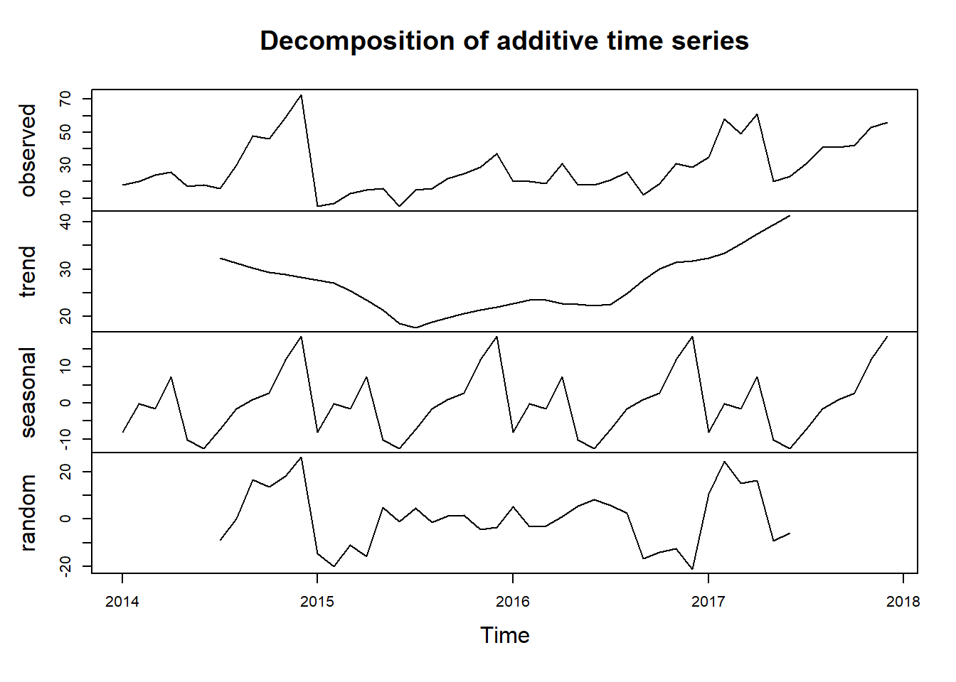
Looks like we have a better seasonality pattern here on our Gain Side for profit.
gen_monthly_profit = raw_sales_data %>%
  group_by(Month_Year) %>%
  reframe(
    Profit = sum(Profit)
  ) %>%
  mutate(
    Month_Year = paste(Month_Year,"01",sep = "-"),
    Month_Year = as.Date(Month_Year,"%B-%Y-%d")
  )

gen_monthly_profit %>%
  ggplot(aes(x = Month_Year, y = Profit)) +
  geom_point() +
  geom_line()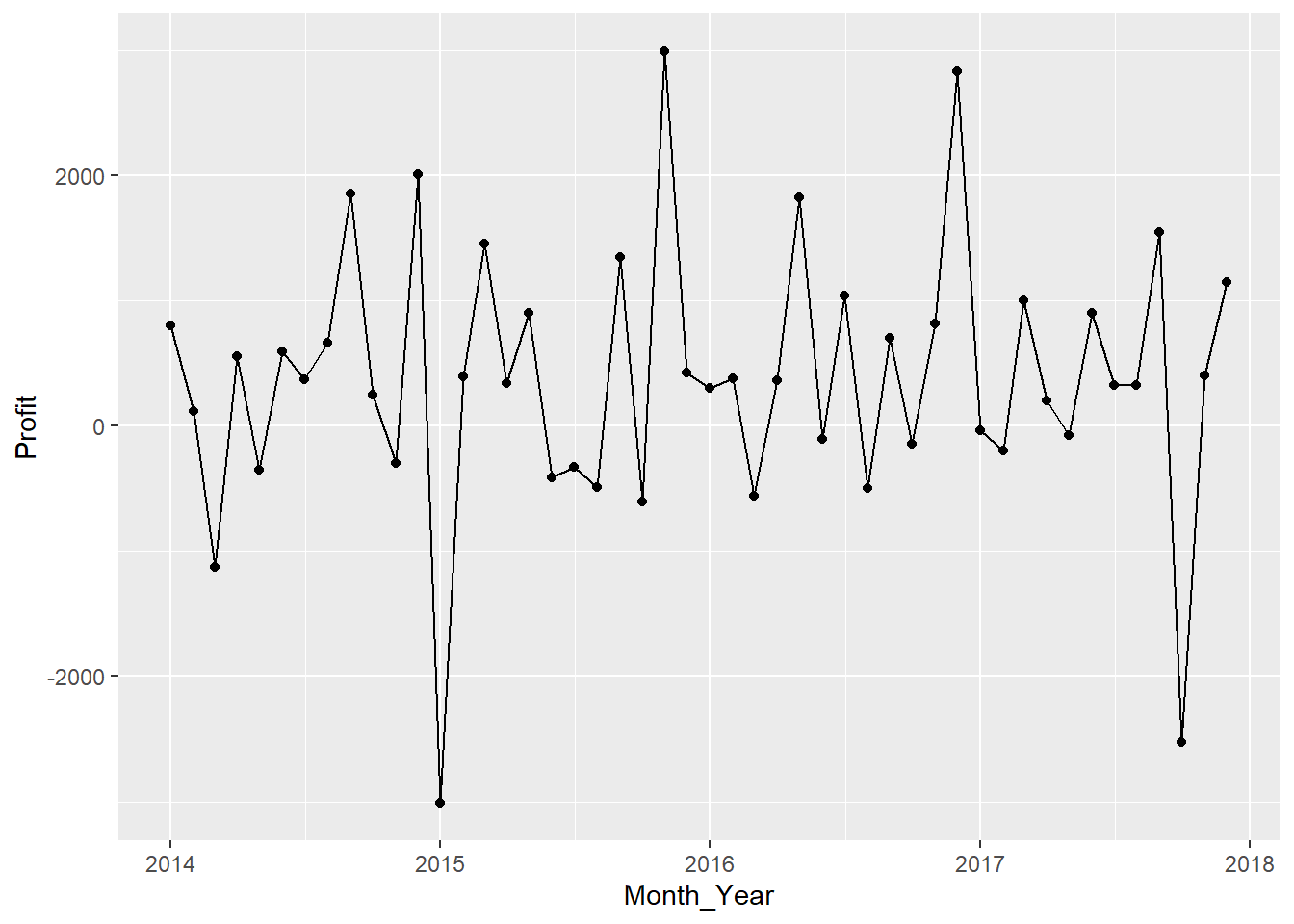
#Check if there is a trend or seasonality??

ts_gen_profit_month = ts(gen_monthly_profit$Profit,start = c("2014","01"),frequency = 12)

decompose(ts_gen_profit_month) %>% plot()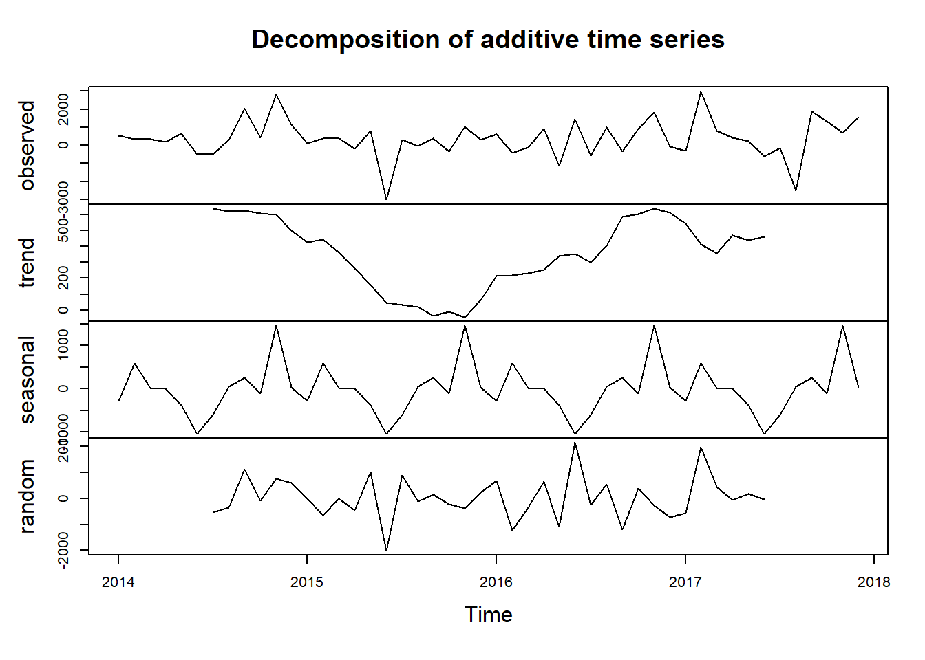
#November appears to be the month we have the highest sale for each year and June to have the lowest sale.#Lets check the number of orders, and see if there is seasonality on the count as well
monthly_data_items = raw_sales_data %>%
group_by(Month_Year) %>%
reframe(
Quantity = sum(Quantity,na.rm = TRUE)
)%>%
mutate(
Month_Year = paste(Month_Year,"01",sep = "-"),
Month_Year = as.Date(Month_Year,"%B-%Y-%d")
)
monthly_data_items %>%
ggplot(aes(x = Month_Year,y = Quantity,group = 1)) +
geom_point() +
geom_line()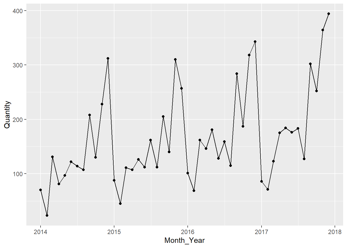
#Lets create a TS Object and try to decompose time series components

ts_quantity = ts(monthly_data_items$Quantity, start = c("2014","01"),frequency = 12)

decomposed_ts = decompose(ts_quantity)
plot(decomposed_ts)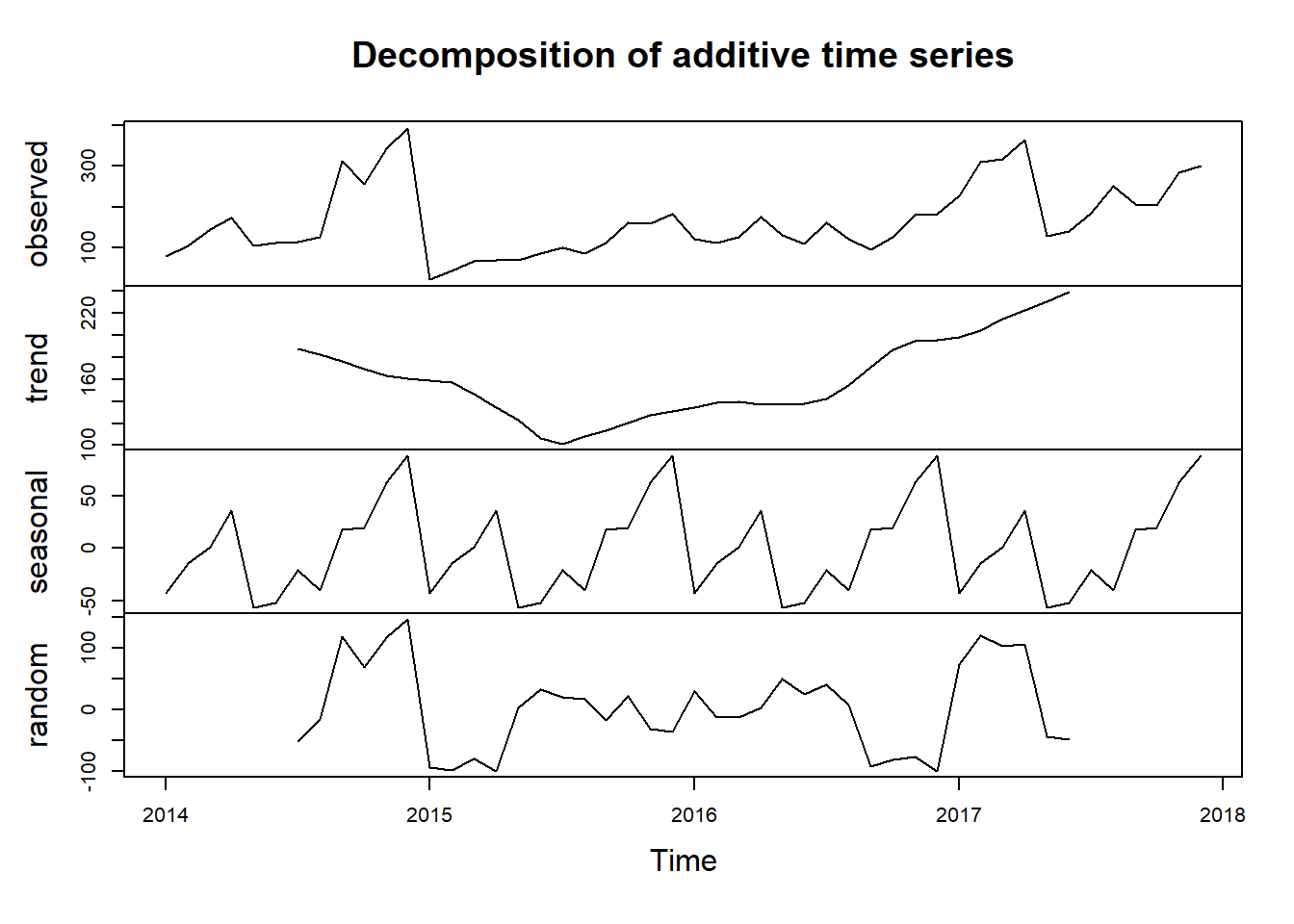
ARIMA, Prophet and GLM
We will build 3 time series models and compare which of these 3 models will perform the best.
Lets create 2 data frames and 2 Splits Object for our Time Series Model.
monthly_sales = raw_sales_data %>%
  group_by(Month_Year) %>%
  reframe(
    Sales = sum(Sales, na.rm = TRUE)
  ) %>%
  mutate(
    Month_Year = paste(Month_Year,"01",sep = "-"),
    Month_Year = as.Date(Month_Year,"%B-%Y-%d")
  )

monthly_quantity = raw_sales_data %>%
  group_by(Month_Year) %>%
  reframe(
    Quantity = sum(Quantity, na.rm = TRUE)
  ) %>%
  mutate(
    Month_Year = paste(Month_Year,"01",sep = "-"),
    Month_Year = as.Date(Month_Year,"%B-%Y-%d")
  )

sales_split = time_series_split(
  monthly_sales,
  assess = "6 months",
  cumulative = TRUE
)

quantity_split = time_series_split(
  monthly_quantity,
  assess = "6 months",
  cumulative = TRUE
)
ARIMA
Sales Forecast
#View the partition using time series plot
sales_split %>%
  tk_time_series_cv_plan() %>%
  plot_time_series_cv_plan(Month_Year,Sales)
model_arima_sales = arima_reg() %>%
set_engine("auto_arima") %>%
fit(Sales ~ Month_Year, training(sales_split))
model_arima_salesparsnip model object
Series: outcome
ARIMA(0,0,0)(0,1,1)[12] with drift
Coefficients:
sma1 drift
-0.5646 120.1691
s.e. 0.3715 43.5067
sigma^2 = 14370932: log likelihood = -290.92
AIC=587.83 AICc=588.76 BIC=592.04Quantity Forecast
#View the partition using time series plot
quantity_split %>%
  tk_time_series_cv_plan() %>%
  plot_time_series_cv_plan(Month_Year,Quantity)
model_arima_quantity = arima_reg() %>%
set_engine("auto_arima") %>%
fit(Quantity ~ Month_Year, training(quantity_split))
model_arima_quantityparsnip model object
Series: outcome
ARIMA(0,0,0)(1,1,0)[12] with drift
Coefficients:
sar1 drift
-0.6634 1.7887
s.e. 0.1491 0.2807
sigma^2 = 681.5: log likelihood = -142.88
AIC=291.76 AICc=292.68 BIC=295.96Prophet
Sales Forecast
model_prophet_sales = prophet_reg(seasonality_yearly = TRUE) %>%
  set_engine("prophet") %>%
  fit(Sales ~ Month_Year, training(sales_split))

model_prophet_sales
parsnip model object
PROPHET Model
- growth: 'linear'
- n.changepoints: 25
- changepoint.range: 0.8
- yearly.seasonality: 'TRUE'
- weekly.seasonality: 'auto'
- daily.seasonality: 'auto'
- seasonality.mode: 'additive'
- changepoint.prior.scale: 0.05
- seasonality.prior.scale: 10
- holidays.prior.scale: 10
- logistic_cap: NULL
- logistic_floor: NULL
- extra_regressors: 0Quantity Forecast
model_prophet_quantity = prophet_reg(seasonality_yearl = TRUE) %>%
  set_engine("prophet") %>%
  fit(Quantity ~ Month_Year, training(quantity_split))

model_prophet_quantity
parsnip model object
PROPHET Model
- growth: 'linear'
- n.changepoints: 25
- changepoint.range: 0.8
- yearly.seasonality: 'TRUE'
- weekly.seasonality: 'auto'
- daily.seasonality: 'auto'
- seasonality.mode: 'additive'
- changepoint.prior.scale: 0.05
- seasonality.prior.scale: 10
- holidays.prior.scale: 10
- logistic_cap: NULL
- logistic_floor: NULL
- extra_regressors: 0GLM
Sales Forecast
# On this model, we try to add components of a our data object as our predictor.
model_glmnet_sales = linear_reg(penalty = 0.01) %>%
  set_engine("glmnet") %>%
  fit(
    Sales ~ lubridate::month(Month_Year, label = TRUE) +
      as.numeric(Month_Year),
    training(sales_split)
  )
Quantity Forecast
model_glmnet_quantity = linear_reg(penalty = 0.01) %>%
  set_engine("glmnet") %>%
  fit(
    Quantity ~ lubridate::month(Month_Year, label = TRUE) +
      as.numeric(Month_Year),
    training(quantity_split)
  )
Model Evaluation
We will consolidate our 3 models into one object and for comparison and evaluation.
Sales Forecast Evaluation
#Create Calibration table
model_tbl_sales = modeltime_table(
  model_arima_sales,
  model_prophet_sales,
  model_glmnet_sales
)

calib_tbl_sales = model_tbl_sales %>%
  modeltime_calibrate(testing(sales_split))


calib_tbl_sales %>% modeltime_accuracy() %>%
  select(`.model_id`,`.model_desc`,rmse,rsq)
# A tibble: 3 × 4
.model_id .model_desc rmse rsq
<int> <chr> <dbl> <dbl>
1 1 ARIMA(0,0,0)(0,1,1)[12] WITH DRIFT 4200. 0.816
2 2 PROPHET 4661. 0.789
3 3 GLMNET 4272. 0.818the modeltime_accuracy() can show us multiple accuracy metrics for our Sales Forecast Models. But for the purpose of our project, we will only select the model_id, model_desc, rmse and rsq (R-squared).
On the script below, we will see how the 3 model performs in comparison with our testing dataset.
calib_tbl_sales %>%
  modeltime_forecast(
    new_data = testing(sales_split),
    actual_data = monthly_sales
  ) %>%
  plot_modeltime_forecast()
We will then use the model to generate our 6 months forecast and plot it.
future_forecast_tbl_sales = calib_tbl_sales %>%
  modeltime_refit(monthly_sales) %>%
  modeltime_forecast(
    h = "6 months",
    actual_data = monthly_sales
  )

future_forecast_tbl_sales %>%
  plot_modeltime_forecast()
Let’s repeat the process for Quantity Prediction.
#Create Calibration table
model_tbl_quantity = modeltime_table(
  model_arima_quantity,
  model_prophet_quantity,
  model_glmnet_quantity
)

calib_tbl_quantity = model_tbl_quantity %>%
  modeltime_calibrate(testing(quantity_split))


calib_tbl_quantity %>% modeltime_accuracy() %>%
  select(`.model_id`,`.model_desc`,rmse,rsq)
# A tibble: 3 × 4
.model_id .model_desc rmse rsq
<int> <chr> <dbl> <dbl>
1 1 ARIMA(0,0,0)(1,1,0)[12] WITH DRIFT 42.8 0.895
2 2 PROPHET 36.4 0.953
3 3 GLMNET 39.1 0.943calib_tbl_quantity %>%
modeltime_forecast(
new_data = testing(quantity_split),
actual_data = monthly_quantity
) %>%
plot_modeltime_forecast()future_forecast_tbl_quantity = calib_tbl_quantity %>%
modeltime_refit(monthly_quantity) %>%
modeltime_forecast(
h = "6 months",
actual_data = monthly_quantity
)
future_forecast_tbl_quantity %>%
plot_modeltime_forecast()Conclusion
After using 3 different Forecast Model, we can safely say that Prophet and GLM model outperformed ARIMA model. Both Prophet and GLM was able to capture the seasonality the variation of the original data. ARIMA’s forecast on Sales Data is a straight line only which for us won’t make much of sense in a real-life setting.